纯css3实现宠物小鸡
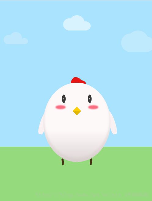
用css3写出一只小母鸡的模样;
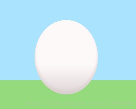
先看最终效果图:
接下来是我书写的步骤:
首先是html,分别写出云朵,小鸡的身体,鸡冠,眼睛,嘴巴,腮红,翅膀,鸡爪
<body>
<div class="content">
<div class="cloud">
<div class="content"></div>
</div>
<div class="crest"></div>
<div class="hand"></div>
<div class="egg">
<div class="eye"></div>
<div class="blush"></div>
<div class="mouth"></div>
<div class="feet"></div>
</div>
</div>
</body>
接下来是css设置样式:
先设置整体的背景色,使用的是线性渐变linear-gradient,设置蓝天色和草地色,并设置让元素居中。
.content {
width: 100%;
height: 800px;
background: linear-gradient(rgb(170, 227, 253) 60%, rgb(149, 219, 126) 80px);
display: flex;
justify-content: center;
align-items: center;
}
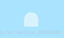
天上的云:先给一定的宽高和背景色,使用border-radius设置边框圆角效果,只设置左上和右上。效果如下:
border-radius: 100% 100% 0 0;
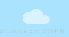
在使用::before和::after伪元素画出一朵完整的云:
.content::before,
.content::after {
content: '';
position: absolute;
bottom: 0;
}
.content::before {
width: 40px;
height: 40px;
background: currentColor;
left: -20px;
border-radius: 100% 100% 0 100%;
}
.content::after {
width: 35px;
height: 30px;
background: currentColor;
right: -20px;
border-radius: 100% 100% 100% 0;
}
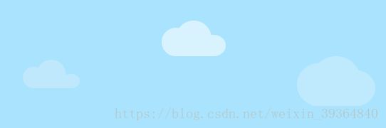
然后使用阴影在画出两朵云
.content,
.content::before,
.content::after {
box-shadow:
-200px 50px 0 -5px rgb(191, 232, 252),
200px 60px 0 10px rgb(191, 233, 253);
}
云朵实现了。
接下来是宠物小鸡,先把身体写出来,同样用border-radius设置边框圆角效果,画出鸡蛋的模样,设置背景色,并使用box-shadow设置向内的阴影。
.egg {
width: 220px;
height: 260px;
border-radius: 100%;
background: linear-gradient(rgb(254, 249, 249) 60%,rgb(221, 213, 213));
position: absolute;
display: flex;
flex-direction: column;
align-items: center;
box-shadow: 0 -10px 10px 3px rgba(211, 194, 194,0.4) inset;
}
鸡冠和云朵的写法差不多
.crest {
position: relative;
top: -17%;
width: 30px;
height: 25px;
background: rgb(233, 19, 19);
border-radius: 50% 100% 20% 20%;
}
.crest::before,
.crest::after {
content: '';
position: absolute;
bottom: 0;
width: 20px;
background: rgb(233, 19, 19);
}
.crest::before {
left: -5px;
height: 20px;
border-radius: 100% 50% 0 20%;
}
.crest::after {
right: -15px;
height: 15px;
background: rgb(233, 19, 19);
border-radius: 20% 200% 20% 30%;
}
眼睛,翅膀,腮红,分别用伪元素左右定位设置大小即可实现。嘴部使用transform旋转45°并使用线性渐变设置鸡嘴的阴影效果。
全部css代码如下(我安装了sass插件,所以是scss的写法):
body {
margin: 0;
width: 100%;
height: 100%;
>.content {
width: 100%;
height: 800px;
background: linear-gradient(rgb(170, 227, 253) 60%, rgb(149, 219, 126) 80px);
display: flex;
justify-content: center;
align-items: center;
>.cloud {
position: absolute;
top: 5%;
color: rgb(216, 242, 254);
>.content {
width: 50px;
height: 50px;
background: currentColor;
border-radius: 100% 100% 0 0;
}
>.content::before,
>.content::after {
content: '';
position: absolute;
bottom: 0;
}
>.content::before {
width: 40px;
height: 40px;
background: currentColor;
left: -20px;
border-radius: 100% 100% 0 100%;
}
>.content::after {
width: 35px;
height: 30px;
background: currentColor;
right: -20px;
border-radius: 100% 100% 100% 0;
}
>.content,
.content::before,
.content::after {
box-shadow: -200px 50px 0 -5px rgb(191, 232, 252),
200px 60px 0 10px rgb(191, 233, 253);
}
}
>.egg {
width: 220px;
height: 260px;
border-radius: 100%;
background: linear-gradient(rgb(254, 249, 249) 60%,rgb(221, 213, 213));
position: absolute;
display: flex;
flex-direction: column;
align-items: center;
box-shadow: 0 -10px 10px 3px rgba(211, 194, 194,0.4) inset;
>.eye::before,
.eye::after {
content: '';
position: absolute;
top: 15%;
width: 12px;
height: 28px;
border-radius: 100%;
background: radial-gradient(white 1px, rgb(57, 56, 57) 5%);
}
> .eye::before{
left: 28%;
}
>.eye::after {
right: 28%;
}
>.blush::before,
.blush::after {
content: '';
position: absolute;
top: 30%;
width: 25px;
height: 5px;
transform: rotate(0deg);
background: rgb(250, 108, 127);
border-radius: 100%;
box-shadow: 0 0 5px 4px rgb(250, 108, 127);
}
>.blush::before {
left: 20%;
}
>.blush::after {
right: 20%;
}
>.mouth {
position: absolute;
top: 32%;
width: 20px;
height: 20px;
background:
linear-gradient(135deg, rgb(255, 207, 0) 50%,
rgb(224, 184, 2) 50%);
transform: rotate(45deg);
border-radius: 5% 15%;
}
> .feet::before,
.feet::after{
content: '';
position: absolute;
bottom: -12px;
width: 10px;
height: 15px;
border: 7px solid rgb(71, 49, 20);
}
> .feet::before{
left: 60px;
border-radius: 80% 100% 100% 50%;
transform: rotate(-10deg);
border-color: transparent transparent transparent rgb(71, 49, 20);
}
> .feet::after{
right: 60px;
border-radius: 100% 80% 50% 0%;
transform: rotate(10deg);
border-color: transparent rgb(71, 49, 20) transparent transparent ;
}
}
>.crest {
position: relative;
top: -17%;
width: 30px;
height: 25px;
background: rgb(233, 19, 19);
border-radius: 50% 100% 20% 20%;
}
>.crest::before,
.crest::after {
content: '';
position: absolute;
bottom: 0;
width: 20px;
background: rgb(233, 19, 19);
}
>.crest::before {
left: -5px;
height: 20px;
border-radius: 100% 50% 0 20%;
}
>.crest::after {
right: -15px;
height: 15px;
background: rgb(233, 19, 19);
border-radius: 20% 200% 20% 30%;
}
> .hand{
position: relative;
top: -5%;
}
> .hand::before,
.hand::after{
content: '';
position: absolute;
}
> .hand::before{
left:-135px;
width: 20px;
height: 80px;
transform: rotate(15deg);
background: rgb(250, 242, 242);
border-radius: 100% 0 50% 50%;
}
> .hand::after{
right: -110px;
width: 20px;
height: 80px;
transform: rotate(-15deg);
background: rgb(250,242,242);
border-radius: 50% 100% 50% 50%;
}
}
}
代码很多地方写的还不是很严谨,往后的日子会继续努力提高自己,让代码更有质量。
如果有时间,会持续更新此篇文章。
相关知识
html页面小宠物代码大全,纯css3实现宠物小鸡实例代码
【宠物鸡】小鸡花生一展歌喉!
宠物行业的发展前景分析论文
SSM宠物领养系统非功能需求分析
设计一个包含HTML、CSS和JavaScript代码的宠物领养系统网页界面
宠物小鸡下载
宠物小鸡
PHP实现的宠物寄养服务系统设计与实现
办公室潮人养宠物小鸡过瘾(四)
宠物小鸡养成
原文链接: 纯css3实现宠物小鸡 https://www.mcbbbk.com/newsview807247.html
| 上一篇: 顽皮贪玩的小鸡宠物名字有哪些 | 下一篇: 魔兽世界机械小鸡任务怎么完成 机... |
推荐分享


- 1养玉米蛇的危害 30900
- 2狗交配为什么会锁住?从狗狗生... 8072
- 3我的狗老公李淑敏33——如何... 7037
- 4中国境内禁养的十大鸟种,你知... 5714
- 5petpet generat... 5412
- 6原创 ... 5340
- 7自制狗狗辅食:棉花面纱犬的美... 4976
- 8豆柴犬为什么不建议养?可爱的... 4960
- 9家养水獭多少钱一只正常 4938
- 10南京宠物粮食薄荷饼宠物食品包... 4933

